BMR 617: Statistical Techniques for the Biomedical Sciences
Exponential Growth
Exponential growth is a the mathematical description of a quantity that is multiplied by a fixed quantity every fixed unit of time.
Exponential growth occurs in many places in biology:
- During cell division and replication
- In Polymerase Chain Reaction (PCR)
- During the early stages of disease outbreak
Let's think about an infectious disease outbreak, and think about the number of people infected at some time after the start of the outbreak. (If you want to make this less abstract, we'll examine the start of the COVID-19 outbreak in the US shortly, so you can think in terms of that example.)
We'll make the following assumptions:
- A relatively small proportion of the population is infected
- Infected people come into contact with uninfected people, and infected people may infect uninfected people
- Each infected person will, on average, infect \(r\) new people each day.
Suppose we start monitoring this output and measure the number of cases each day. We'll denote by \(n(t)\) the number of cases \(t\) days after we start monitoring the outbreak. For simplicity here, by "cases" we mean people who have become infected at some point (we don't account for recovery from the disease).
Let's think about how \(n(t)\) changes as we move from one day to the next. Each of the \(n(t)\) infected people will infect \(r\) new people in that day, so there will be \(r\times n(t)\) new infections. The \(n(t)\) people who were already infected are still people who have been infected, so the total number of cases on day \(t+1\), \(n(t+1)\) is \(n(t)+r\times n(t)=(1+r)n(t)\). So each day (unit of time) the number of cases is multiplied by \(1+r\) (a fixed amount). This is exponential growth.
We can easily find a formula for \(n(t)\) in terms of the initial number of infected people (the number infected when we start monitoring the disease), the infection rate \(r\), and the time \(t\). Suppose the number at the start of monitoring (day 0) is \(A\), so \(n(0)=A\). Then the nunber after one day is \(n(1)=A(1+r)\) (because each day the number of cases is multiplied by \(1+r\)).
The number two days after we start monitoring is \(n(2)=n(1)(1+r)=A(1+r)(1+r)=A(1+r)^2\).
The number three days after we start monitoring is \(n(3)=n(2)(1+r)=A(1+r)^2(1+r)=A(1+r)^3\).
And in general, the number of cases \(t\) days after we start monitoring is \(n(t)=A(1+r)^t\).
We can see what this looks like graphically in R. Let's suppose we start monitoring immediately the first case arises, so \(A=1\). Just for an example, let's suppose every person infects another person once every 10 days, so \(r=0.1\). Then \(n(t)=1.1^t\). We can simulate a month's data with
	library(tidyverse)
	infect.data <- tibble(t=0:30, n=1.1^t)
	ggplot(infect.data, aes(x=t, y=n)) + geom_line()
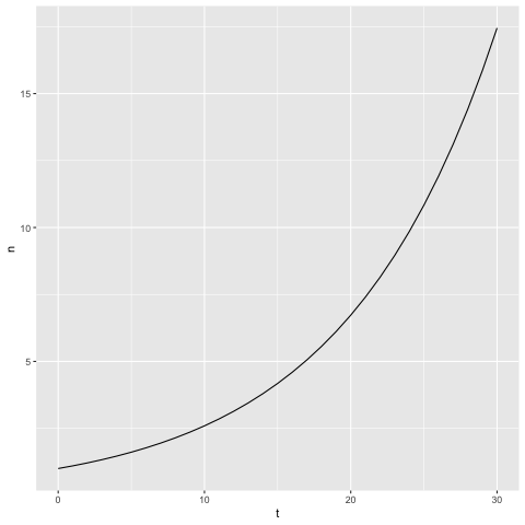
This graph shows the typical features of exponential growth; the quantity increases over time, and the rate of increase also increases over time.
Let's examine some real data. Of course, in real life, the number of cases will not follow an exact exponential curve, but near the beginning of an outbreak it will approximate it well.
The Center for Systems Science and Engineering at Johns Hopkins University
has been instrumental in tracking COVID-19 infection data since the beginning of the pandemic. They maintain a
public data repository with daily updates.
The GitHub URL for the data is quite long, so just for readability I've divided it up
here over a few lines, and used paste to define it:
global.covid19.data.URL = paste(
  "https://github.com/CSSEGISandData/COVID-19",
  "raw/master/csse_covid_19_data/csse_covid_19_time_series",
  "time_series_covid19_confirmed_global.csv",
  sep='/')
Load the data:
covid19.data <- read_csv(global.covid19.data.URL)
covid19.data) in the console.
Note the structure of these data: the columns are:
- Province/State: Note that for most, but not all, countries
this is just
NA, and the data are combined for the whole country - Country/Region:
- Lat: The Latitude of the center of the Province/State, or Country/Region
- Long: The Longitude of the center of the Province/State, or Country/Region
- <Date> The remaining columns are for each date for which there is any data, starting with January 22, 2020. These dates (in the column headers) are in the form m/d/yy. The values in the columns give the number of confirmed COVID-19 cases in the region corresponding to the row on the date defined by the column
tidyr package provides a function to do this:
pivot_longer (because it is "pivoting" the table, and making it "longer"
in the sense of having more rows). We want to pivot the date columns, starting with
1/22/20 and going to the last column, and we want to put the column
names (the dates) into a column called date and the values into a
column called cases. The function call to do this is
covid19.data <- pivot_longer(covid19.data, cols=`1/22/20`:ncol(covid19.data),
                names_to = 'date', values_to = 'cases')
View the data again, and note that there are now only six columns; but notice how many rows we now have.
Currently, the date is stored in this table as a character.
(You can see this with class(pull(covid19.data, date)).)
This will also cause
some problems for R: when we plot this, the dates will be organized in alphabetical
order (so, for example, 3/10/23 will come immediately before
3/1/23). To fix this, we'll convert the date column to an R Date type, using the
parse_date function. We need to tell R what format the date is
stored in:
covid19.data <- mutate(covid19.data, date=parse_date(date, format="%m/%d/%y"))
class(pull(covid19.data, date)) again.
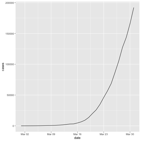
Let's look at the data from the US during the beginning of the outbreak in March 2020. We can filter for Country/Region
as follows:
us.covid19 <- filter(covid19.data, `Country/Region`=='US')
And we can filter by date using
us.covid19.march <- filter(us.covid19, date >= '2020-03-01' & date <= '2020-03-31')
Let's plot these data:
ggplot(us.covid19.march, aes(x=date, y=cases)) +
  geom_line()
Logarithms
A logairthm is the mathematical inverse of an exponential. It "undoes the effect" of raising something to a power.
Formally, we define \(\log_a(x)\) (which we read as "log to the base a of x") as \(y=\log_a(x)\) if \(a^y=x\). In other words, \(\log_a(x)\) is "the exponent you raise \(a\) to, to get \(x\).
The well-known rules for exponentials can be converted to rules for logs: \[\log_a(xy)=\log_a(x)+\log_a(y)\] \[\log_a(x^t)=t\log(x)\]
You can think of this as saying that logs turn multiplication into addition, and raising to the power into multiplication.
It doesn't really matter what base we use for logs, as long as we use them consistently throughout a calculation. Typically we use either base 10 or base 2, which are both reasonably intuitive. \(\log_10\) gives the power of 10 of a number, and \(\log_2\) gives the "number of doublings" that a number represents.
Let's return to our infectious diseases, and think about what happens if we look at the log of the number of cases. We have: \[n(t)=A(1+r)^t\] So (just choosing to take log to the base 2): \[\log_2(n(t))=\log_2\left(A(1+r)^t\right)\] This is the log a \(A\) times something, so we can use the first rule: \[\log_2(n(t))=\log_2A+\log_2\left((1+r)^t\right)\] and now we use the second rule: \[\log_2(n(t))=\log_2A+t\log_2(1+r)\] Notice here \(A\) and \(r\) are constants, so \(\log_2A\) and \(\log_2(1+r\) are also constants.
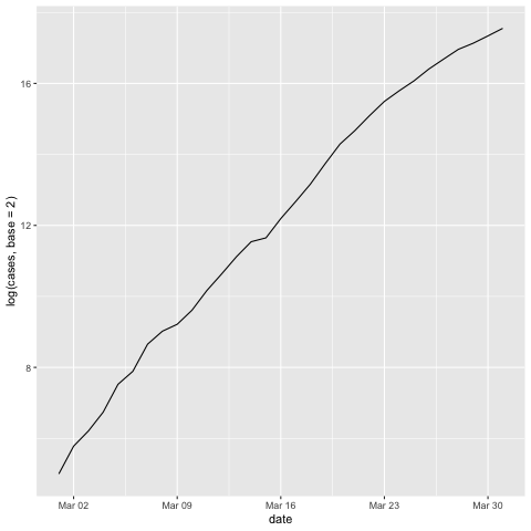
So if we create a graph with \(t\) on the x-axis, and the log of the number of cases on the y-axis, then \[y=a+b\times x\] for some constants \(a\) and \(b\).
This is just the equation of a straight line!
Let's test this. First, let's try our simulated data, which followed an exact exponential growth:
ggplot(inf.data, aes(x=t, y=log(n, base=2))) + geom_line()
Now let's look at the US COVID-19 data from March 2020:
ggplot(us.covid19.march, aes(x=date, y=log(cases, base=2))) + geom_line()
The bottom line here is that:
Real Time Polymerase Chain Reaction (PCR)
Real-time quantitative PCR (RT-qPCR) is used to quantify the amount of DNA present in a sample. It is almost always used to quantify RNA, by using reverse-transcriptase to create cDNA from the RNA, and then to quanitfy the cDNA.
RT-qPCR works by replicating the DNA present in each machine cycle. The assay starts with a quantity of DNA that is too small to detect, and repeatedly amplifies it until it reaches some threshold, which is comfortably above the minimum detection level. The number of cycles to reach the threshold is recorded. The basic idea here is that the more DNA was present at the beginning, the fewer cycles it will take to reach the threshold.
Suppose the experiment starts with some number of DNA molecules, which we'll call \(A\). On each cycle of the experiment, each DNA molecule is replicated. So the number of molecules after one cycle is \(2\times A\). After two cycles it is \(2\times 2\times A\), after three it is \(2\times 2\times 2\times A\), and in general after \(t\) cycles it is \(2^tA\).
If the threshold is \(T\) and the number of cycles to reach the threshold is \(C_T\), then we must have \[T=2^{C_T}A\] and \[\frac{A}{T}=2^{-C_T}\]
One general problem with RT-qPCR is that it's difficult or impossible to control the total amount of RNA extracted from a sample. To account for this, from each sample the cDNA from a gene of interest is amplified, along with cDNA from a control gene, which is assumed to have constant expression across all samples and experimental conditions. Such control genes are called "housekeeping genes". Common choices for these genes are GAPDH and β-actin.
If \(g\) is the amount of cDNA from the gene of interest, \(h\) is the amount of cDNA from the housekeeping gene, \(C_{T,g}\) the threshold cycle for the gene of interest, and \(C_{T,h}\) the threshold cycle from the housekeeping gene, we have \[\frac{g}{T}=2^{-C_{T,g}}\] and \[\frac{h}{T}=2^{-C_{T,h}}\] Dividing one of these by the other gives \[\frac{g}{h}=\frac{2^{-C_{T,g}}}{2^{-C_{T,h}}}\] or \[\frac{g}{h}=2^{-(C_{T,g}-C_{T,h})}\] If we denote the difference in \(C_T\) values between the gene of interest and the housekeeping gene by \[\Delta C_T=C_{T,g}-C_{T,h}\] then \[\frac{g}{h}=2^{-\Delta C_T}\] In other words, \(2^{-\Delta C_T}\) represents the amount of cDNA from the gene of interest, relative to the amount of cDNA from the housekeeping gene.
While this is rarely noted, we can also write this in log form: \[-\Delta C_T=\log_2\left(\frac{g}{h}\right)\] So \(-\Delta C_T\) is the log (base 2) of the amount of cDNA from the gene of interest relative to the housekeeping gene.
We will use this information extensively in a class on "normalization" (which actually means multiple different things). Computing the cDNA from the gene of interest relative to the housekeeping gene is a form of normalization to account for the difficulty in extracting a consistent total quantity of mRNA from a sample.