BMR 617: Statistical Techniques for the Biomedical Sciences
Samples and Populations
In statistics, we work with data from a sample. Typically, we want to use those data to make inferences about a broader population.
In clinical studies, these terms are fairly clear:
- In the Pfizer vaccine trial, the sample consists of the data from the 36,523 participants.
- The participants in the (initial) trial were all adults, so the population about whom we want to draw conclusions is the entire population of human adults
In a lab experiment, the concept of population is a little more abstract.
In our mouse metabolic data, we have a sample of Cholesterol levels for six TH mice fed a Chow diet. The population in this case is "all TH mice fed a Chow diet". Of course, this only happens if we make it happen, since these mice are lab mice and are raised and fed in the lab. So the population is a little abstract: all possible cholesterol values that could be measured from TH mice fed a chow diet.
There's a litte philosophical leap we make here. We assume there is some value of the Cholesterol level that is due to being a TH mouse and having been fed a Chow diet. Every measurement we make will be different, and we assume those differences are due to factors which are not related to Strain or Diet. Ultimately the population is the distribution of all possible values of Cholesterol level for TGH mice fed a Chow diet.
Our aim in inferential statistics in the context of bench science is to generate a (typically small) sample of values, and from it make inferences about the distribution from which that sample is drawn.
The Central Limit Theorem
The Central Limit Theorem is one of the most important underlying principles in making inferences about populations from samples (particularly for quantitative data).
Suppose we take a sample of \(n\) values from any distribution, with mean \(\mu\) and standard deviation \(\sigma\). We can measure the mean of those \(n\) sample values, which we'll call \(m\).
Notice here we use greek letters when referring to the population, which is infinite (or large enough to consider it so), and latin letters when referring to the sample. This is a standard convention.
So, for our TH mice fed the Chow diet, we have six Cholesterol levels. We can calculate the mean of these, e.g. using
	library(tidyverse)

    met <- read_csv("https://denvirlab.marshall.edu/BMR617-2024/data/TH-B6-metabolic.csv") %>%
      separate(MouseID, sep="-", into=c("Strain","Diet","Id"))
    met %>% group_by(Strain, Diet) %>% summarise(Chol=mean(Cholesterol))
and we'd get a sample mean of \(m=101.2\). This is an approximation to the
"true mean", \(\mu\), which we don't (and never will) know.
If we repeated the experiment with a different set of six mice, we'd get a different mean. If we continued to repeat the experiment over and over, we'd have a whole set of sample means. The Central Limit Theorem tells us what the distribution of those sample means looks like.
The sample means of a collection of samples of size \(n\) drawn from a distribution with mean \(\mu\) and standard deviation \(\sigma\) is approximately normally distributed, with mean \(\mu\) and standard deviation \(\frac{\sigma}{\sqrt{n}}\).
The first thing this tells us is that the (theoretical) mean of all possible sample means is the same as the population mean. This part isn't too surprising.
The next thing this tells us is that the standard deviation of all these sample means is the standard deviation of the population, divided by the square root of the sample size.
To interpret this, remember that the standard deviation is the average distance of a point from the mean. So if we think of our sample mean \(m\) as an approximation to the population mean \(\mu\), this says that the average error in this approximation is \(\frac{\sigma}{\sqrt{n}}\).
The final thing the Central Limit Theorem tells us is that the distribution of all possible sample means of size \(n\) is approximately normally distributed, no matter the underlying distribution of the population. This is a subtly surprising fact. The approximation here might be quite crude, but will get better as \(n\) increases.
The Problem with the Central Limit Theorem
One important thing to note about the central limit theorem is that the standard deviation of sample means, which we loosely interpret as the average distance (error) between a sample mean and the population mean is \[\frac{\sigma}{\sqrt{n}}\] where \(\sigma\) is the standard deviation of the population.
The problem here is we never really know the entire population, so we never actually know \(\sigma\).
We can, of course, calculate the standard deviation of the sample, \(s\), which is an approximation to \(\sigma\).
But how good an approximation depends on the distribution of the population, and the sample size.
The Standard Error of the Mean
The quantity \[\frac{s}{\sqrt{n}}\] is called the standard error of the mean.
Loosely speaking, it is an approximation to the average error we make by using our sample mean as an approximation for the population mean. It's only an approximation to that value, because we are using the sample standard deviation, \(s\), in place of the population standard deviation, \(\sigma\).
Computing Standard Error of the Mean in R
We can compute the standard error of the mean in R as a grouped summary table.
	met_summary <- met %>% group_by(Strain, Diet) %>%
  	  summarise(Chol=mean(Cholesterol), CholSD = sd(Cholesterol), n=n(), sem=CholSD/sqrt(n))
	met_summary
Bar Charts, Revisited
We've previously plotted quantitative data using box plots and column scatter plots
- Probably the best way to show the data
- All data are shown, not just summary statistics
However, some people still prefer bar charts. The bar chart shows the sample mean, and "error bars" are used to show the spread of the data.
Error Bars
When showing error bars on bar charts we (currently) have two options: standard deviation, or standard error of the mean. Which should we use?
Remember our interpretation:
- The standard deviation is the average distance of a point in the data set from the mean. It's a measure of the spread in the sample.
- The standard error of the mean is the average error in using the sample mean as an approximation of the population mean. It's a measure of the precision of using this sample for inference about the population.
- Typically used to describe potential confounding variables in, for example, clinical trials
- Show that both control and treatment groups have similar age distributions, for example.
- We want to show that our sample is representative of the population
- At least quantify the extent to which it represents the population
The most important thing is to clearly state what your error bars represent.
Bar Charts in R
Let's start by plotting bar charts just for the TH mice. We'll create a subset of the
	th_summary <- met_summary %>%
	  filter(Strain=="TH")

	ggplot(th_summary, aes(x=Diet, y=Chol)) +
      geom_bar(stat="identity", fill="#00b140") +
      geom_errorbar(aes(ymin=Chol - sem, ymax=Chol + sem), width=0.2)
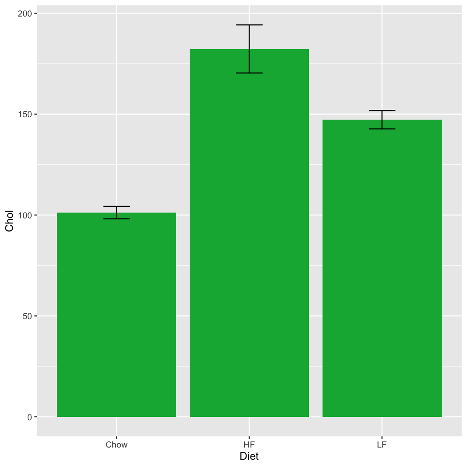
The geom_errorbar takes some new aesthetics: a ymin
and ymax. We need to compute these: if we want error bars showing
the standard error of the mean, they need to extend sem above
and below the mean Cholesterol value.
The geom_errorbar also takes a width parameter, specifying
how wide the bar should be. These are in units of the width of one column.
Experiment with this value and see what looks good.
To plot all groups, we can use our full met_summary summary table.
We'll set the x value to the Strain and color the bars by Diet
using the fill aesthetic.
	ggplot(met_summary, aes(x=Strain, y=Chol, fill=Diet)) +
      geom_bar(stat="identity", position=position_dodge()) +
      geom_errorbar(aes(ymin=Chol - sem, ymax=Chol + sem), width=0.2, position=position_dodge(0.9))
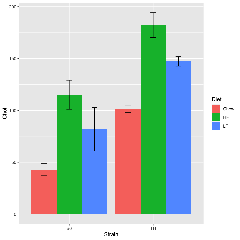
The position_dodge() moves the bars and error bars to form a
"grouped bar chart". The 0.9 parameter for the error bars accounts for
the gap between the groups. Some trial and error is sometimes necessary!
Summary
- We typically compute statistics on a sample as an approximation to what is happening in a larger (possibly infinite) population.
- For quantitative data, the Central Limit Theorem gives a way to estimate how precisely a sample mean estimates a population mean
- The standard error of the mean is \(\frac{s}{\sqrt{n}}\), and is an
approximation to the average distance between a sample mean of size \(n\) and
the mean of the population from which the sample is drawn
- It's an approximation because we use the sample standard deviation, \(s\), instead of the population standard deviation, \(\sigma\).
- When plotting bar charts, use error bars and choose an appropriate metric for the
error bar
- If the aim is inference, the standard error of the mean is a good choice
- If the aim is simply to describe the sample data set, the standard deviation may be better
- These are not the only options
- Always state clearly what the error bars represent