BMR 617: Introduction to Graphing in R
Roles of Variables
We've talked previously about types of variables:
- Nominal
- Ordinal
- Interval
- Ratio
- Categorical (C)
- Quantitative (Q)
Response Variables
In an experiment or study, a response variable is a variable of interest. It measures or classifies an outcome.
Explanatory Variables
In an experiment or study, an explanatory variable is a variable of which we believe may influence the value of a response variable.
Examples
Considering our mouse metabolic data, classify each of the variables according to their type and role:
Graphing for the C-Q case
Start RStudio, load the tidyverse library, and load up our usual data set:
    library(tidyverse)
    met<- read_csv("https://denvirlab.marshall.edu/BMR617-2024/data/TH-B6-metabolic.csv") %>%
  		separate(MouseID, sep="-", into=c("Strain","Diet","Id"))")
We'll start by graphing the Cholesterol against the Strain. Here our explanatory variable, Strain, is categorical and ourvresponse variable, Cholesterol, is quantitative. We refer to this as the "C-Q" case.
There are a few options for graphing in this case:
- Bar charts. These are commonly used, but they are often too simplistic.
- Box and whisker plots. These often provide a useful summary of the data.
- Column scatter plots. These plot all the data points. They can be a good choice if there are a reasonably small number of points.
- Violin plots. These are a little complex to understand, but can be useful for very large data sets.
Introduction to ggplot2
ggplot2 is a R package that is part of tidyverse.
"gg" here stands for "Graphical Grammar". (The package is based around a highly
sophisticated and well-researched theory of expressing graphical ideas in computer
language.) The original ggplot library, which is now obsolete, was rewritten from scratch
to fit into the tidyverse package (hence the "2" at the end).
If you have used graphical software such as Adobe Photoshop, you can think of graphs
in ggplot as being like "layers". You always start with a ggplot object,
which is the base layer of the graph, and then add "geometries" on top of it.
The ggplot function requires at least two inputs: a data table containing
the data to be plot, and an "aesthetics" object. At a minimum, the aesthetics object
needs to specify which variables will represent each axis.
Usually (though not always), the x-axis will represent an explanatory variable, and
the y-axis will represent the response variable. An aesthetics object is created using
the aes() function. So we will need:
ggplot(met, aes(x=Strain, y=Cholesterol))
Try this. What do you get? Why?
In the previous example, we only displayed the base of the graph. We need to add a "geometry", or a "layer", determining how to plot the data. Try
ggplot(met, aes(x=Strain, y=Cholesterol)) + geom_boxplot()
In the "Help" tab (same region of RStudio as the plot), search for geom_boxplot.
Can you figure out what the various parts of the box plot are plotting?
Try
ggplot(met, aes(x=Strain, y=Cholesterol)) + geom_point()
This is called a "column scatter plot". Each point is plotted in a column, with
one separate column for each x-value.
If there are too many points, they will overlap and we will lose some information. We can fix this, if needed, by adding "jitter" to the position of the points:
ggplot(met, aes(x=Strain, y=Cholesterol)) + geom_point(position=position_jitter(width=0.1))
The width parameter here is in units of "one column"; the value 0.1
keeps the points fairly tightly confined to their column.
Barcharts are a little tricky in tidyverse. (I argue this is a good thing. I dislike bar charts and this disuades people from using them!) But we can create a bar chart with:
ggplot(met, aes(x=Strain, y=Cholesterol)) + geom_bar(stat="summary", fun="mean")
By default, a bar chart will not use a y variable in the aesthetics, and
will count the number of items in each category. We override this by saying we want
to use a summary statistic (stat="summary") and specifying which function
to use for that summary: (fun="mean").
I'll show you how to add error bars later in the course.
Which graph do you think is best? What are the pros and cons of each?
Here are some general principles for graphing:
- A "typical value" (average) should always be apparent from the graph
- The spread of the data should always be apparent from the graph
- If possible, show all the data
Exploration
- Create some graphs for Cholesterol against Diet.
- Can you create a graph that shows both the boxplot and the individual points?
Using Color
Color should be used judiciously when graphing.
Various geometries recognize a color or fill parameter.
Try
ggplot(met, aes(x=Diet, y=Cholesterol)) + geom_boxplot(fill="#00b140")
The color specification here is a hexadecimal RGB value, which I'll let you Google
if you like. It's the green used on Marshall University web sites. You can just use
fill="green" if you want something simpler.
Showing multiple categories
A good use of color is to denote the value of another variable. To do this, we
can specify the fill as an aesthetic, so it will vary with
each value. For example:
ggplot(met, aes(x=Diet, y=Cholesterol, fill=Strain)) + geom_boxplot()
Note that the colors here are chosen automatically. We can specify colors with
ggplot(met, aes(x=Diet, y=Cholesterol, fill=Strain)) + geom_boxplot() + scale_fill_manual(values=c("red","blue"))
Problems with color
Using color well takes a lot of thought. What is wrong with
	ggplot(met, aes(x=Diet, y=Cholesterol, fill=Strain)) + geom_boxplot() +
	  scale_fill_manual(values=c("#FED976", "#FEC60C"))
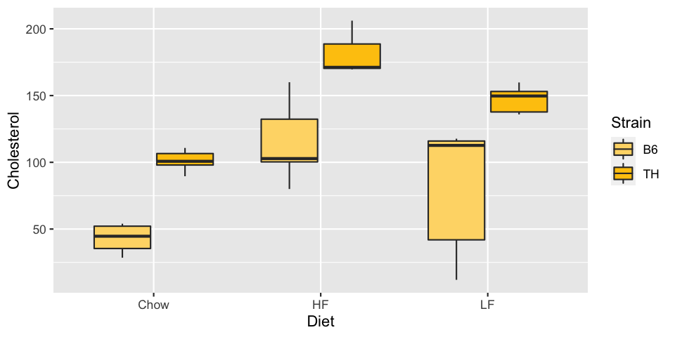
What about
	ggplot(met, aes(x=Diet, y=Cholesterol, fill=Strain)) + geom_boxplot() +
	  scale_fill_manual(values=c("red", "green"))
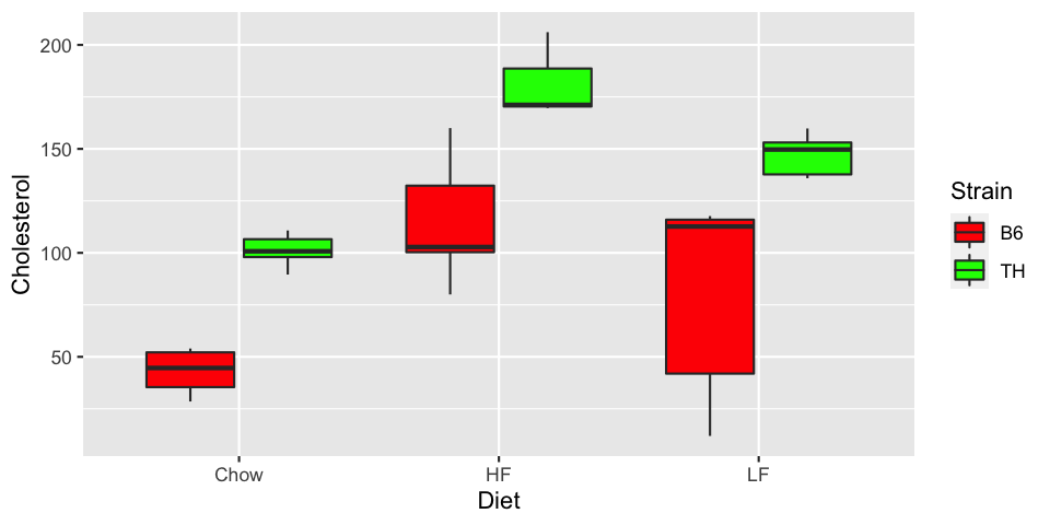
To about 5% of the population, the second graph looks very much like the first. Avoid red and green as contrasts. There are mechanisms in R to choose colors automatically in a way that is friendly to color-blind people. We may look at these in more detail later in the course.
There are other subtle pitfalls with choosing color. Consider this graph:
	ggplot(met, aes(x=Diet, y=Cholesterol, fill=Strain)) + geom_boxplot() +
	  scale_fill_manual(values=c("red", "navy"))
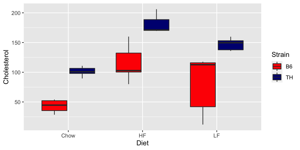
The default colors in R are a good place to start. They tend to avoid issues to do with varying intensity, color-blindness, and others. If you need to change the colors, do so with care.
Putting it all together
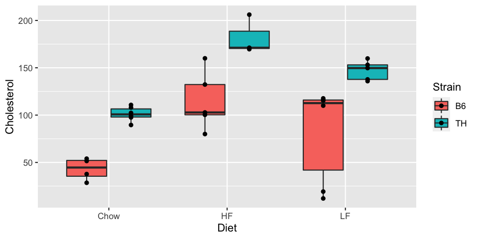
We'll finish by plotting the box plots by diet, colored by strain, and with the points overlaid.
Doing this naïvely results in the points in a single column for each Diet:
ggplot(met, aes(x=Diet, y=Cholesterol, fill=Strain)) + geom_boxplot() + geom_point()
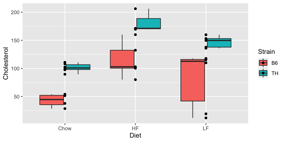
To fix this, we can specify the position of the points as position_dodge.
This takes a width parameter, and the value 0.75 will line
them up over the box plots:
	ggplot(met, aes(x=Diet, y=Cholesterol, fill=Strain)) + geom_boxplot() +
	    geom_point(position=position_dodge(width=0.75))
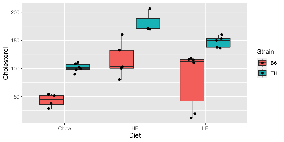
The position function position_jitterdodge does both: it "dodges"
(points line up with the boxes) and adds jitter. We can specify the width for each:
	ggplot(met, aes(x=Diet, y=Cholesterol, fill=Strain)) + geom_boxplot() +
	  geom_point(position=position_jitterdodge(jitter.width = 0.1, dodge.width = 0.75))
Writing to graphics files
By default, when you create a graph, it will be displayed on R's default graphics device. The default device depends on how you are running R, but if you are using R Studio, it will display in the "Plots" pane, which is a tab in the bottom right.
R can create graphics format files. When you create a graphics file, the file itself becomes the "graphics device".
The png(...) function creates a PNG file, which is the best format for most graphics you will create.
The basic structure is
png(filename)
# graphics commands...
dev.off()
dev.off() function turns off the "graphics device", which in this cases essentially closes the file.
The file's contents will not be properly created until this step. Any graphics commands between the png(...)
function and the dev.off() function will be written to that file.
Try the following:
# You may need to adjust the filename for your system
png("~/Desktop/Cholesterol.png")
ggplot(met, aes(x=Diet, y=Cholesterol, fill=Strain)) + geom_boxplot() +
            geom_point(position=position_dodge(width=0.75))
dev.off()
Cholesterol.png file on your desktop. Double-click the file to view it.
Zoom in on the image. How good is the quality?
Computer graphics basically work by having an array of dots, called "pixels" (an abbreviation for "picture elements"). Each dot has three values representing the amount of red, green, and blue light emitted from that point. (There is also a value for transparency.) The resolution of an image is the number of pixels in the image.
The default resolution for an image created by png(...) is 480 pixels wide and 480 pixels high (a total of
230,400 pixels). We can control this by specifying the width and height for the image. To create
an image with 8 times the width and 4 times the height, try:
# You may need to adjust the filename for your system
png("~/Desktop/Cholesterol.png", width=8*480, height=4*480)
ggplot(met, aes(x=Diet, y=Cholesterol, fill=Strain)) + geom_boxplot() +
            geom_point(position=position_dodge(width=0.75))
dev.off()
By default, a pixel is assumed to take \(\frac{1}{72}\) inch when printed. Font size is usually measured in "points", and by default 1 point is \(\frac{1}{72}\)inch. So a 12-point font will take up 12 pixels. In our high-resolution (lots of pixels) image 12 pixels looks very small.
The png(...) takes a res argument, which is the "number of pixels per inch".
By default, it is 72. To increase the number of pixels for our font, we can specify a higher resolution.
Since we increased the vertical dimension by a factor of four, relative to the default, we can do the same for the resolution:
# You may need to adjust the filename for your system
png("~/Desktop/Cholesterol.png", width=8*480, height=4*480, res=4*72)
ggplot(met, aes(x=Diet, y=Cholesterol, fill=Strain)) + geom_boxplot() +
            geom_point(position=position_dodge(width=0.75))
dev.off()